



Manchester United Shirt History
- Brief
- Self-initiated: not a live brief
- Website
- manchesterunitedshirts.com
- Work
- Concept & UX
- Wireframes
- HTML, CSS & JavaScript
- Interaction design
- SEO
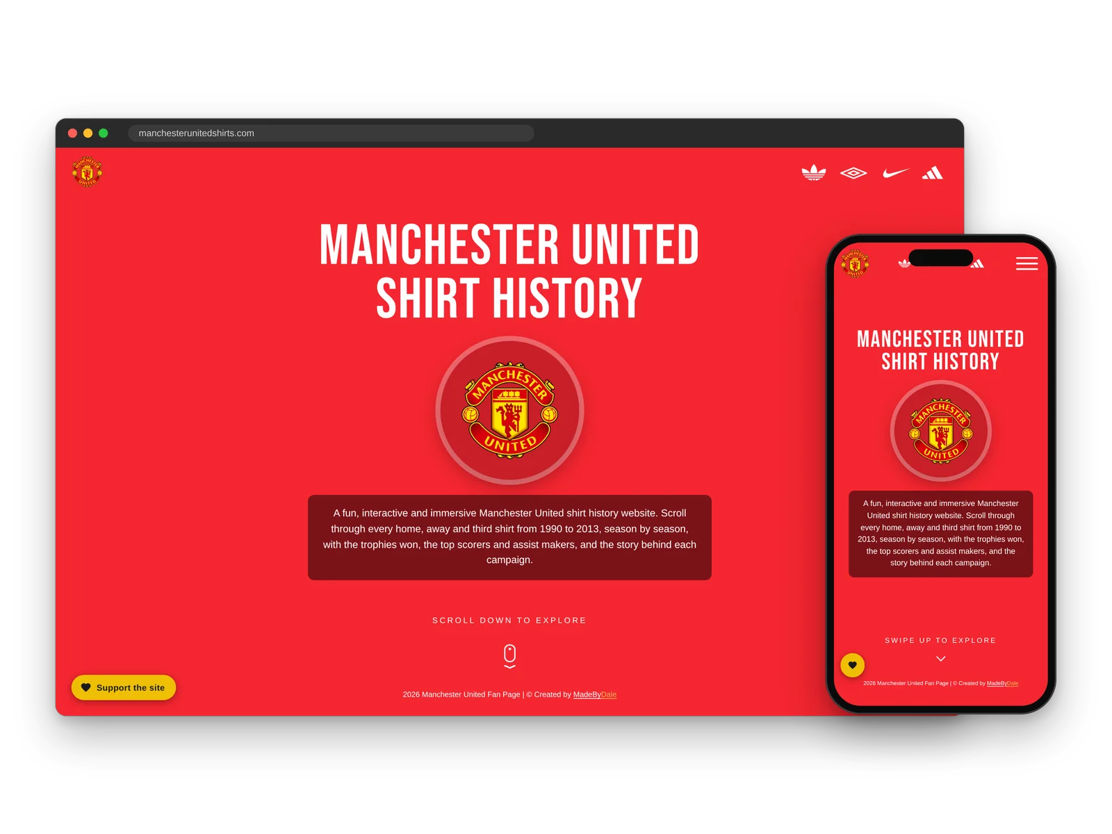
Self-initiated project, not a live brief. An unofficial fan site, not affiliated with or endorsed by Manchester United Football Club.
Manchester United Shirt History isn’t a client project. It’s a self-initiated passion project, so there was no live brief, no client and no deadline: just an idea I wanted to build properly. The site is a fun, interactive way to explore every home, away and third shirt from 1990 to 2013, season by season, with the trophies won, the top scorers and assist makers, and the story behind each campaign. The technical inspiration was to represent a digital, interactive timeline that works just as well on a phone as on a desktop, using pure code.
- Seasons, 1990 to 2013
- 23
- Ways to move through the timeline
- 5
- Frameworks, templates or builders
- 0
The Project
What I designed, why, and how each piece fits the brand.
-
01The Idea
A Passion Project, Not a Live Brief
With no client to answer to, I set my own brief: create the most fun and immersive way to explore Manchester United’s shirt history, with every shirt, the trophies won, the players who made the difference and the story of each campaign, all in one place.
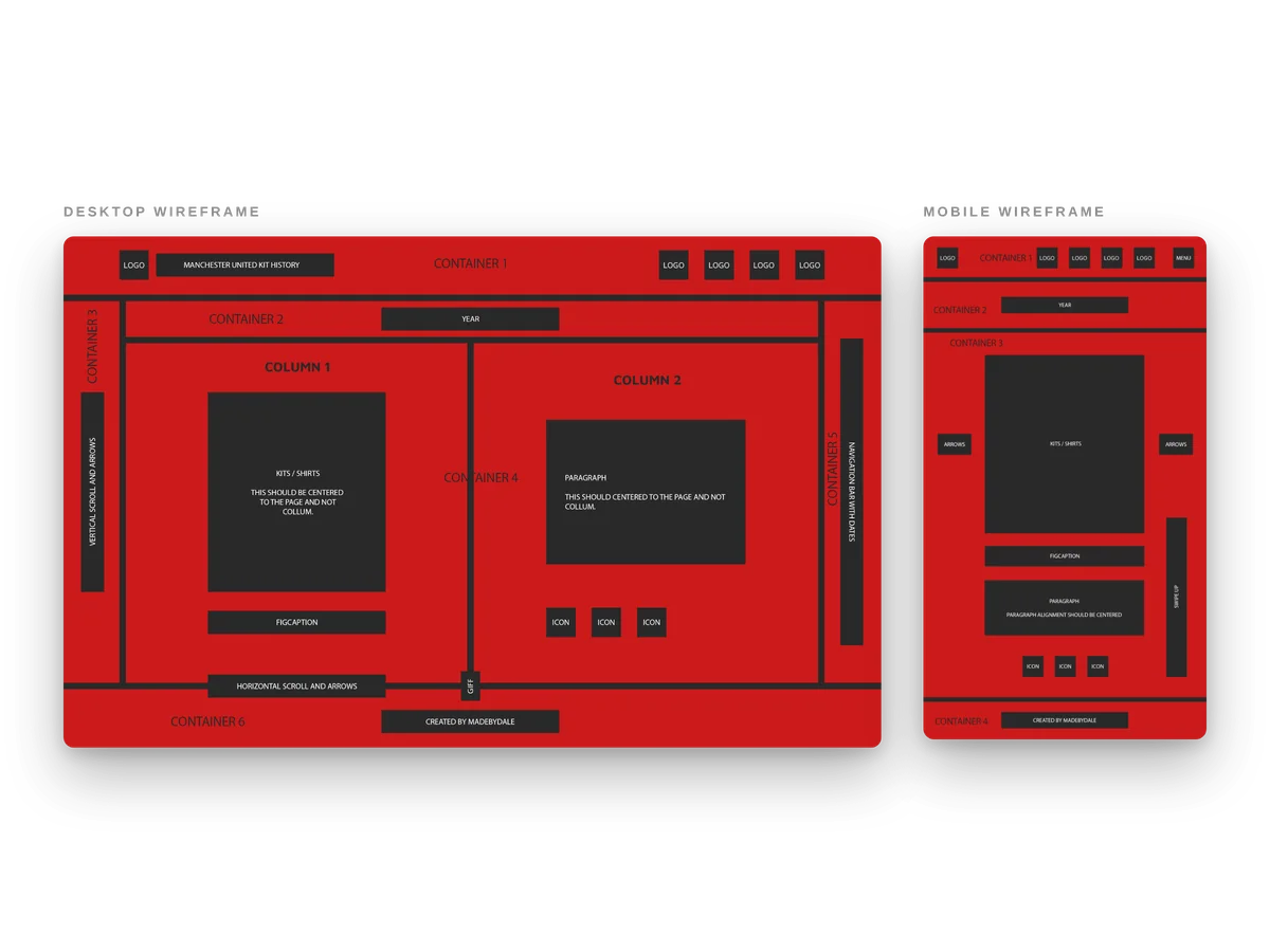
Before writing any code, I wireframed the desktop and mobile layouts in Photoshop, blocking out where the shirts, the year, the story, the trophies and the timeline would sit on a big screen and a small one. On desktop the shirt and the story share the page, with the timeline down the side. On a phone everything stacks around the shirt, with a menu button and a Swipe Up cue in place of the side timeline.
- Self-set brief and goals
- Content planned season by season
- Desktop and mobile wireframes in Photoshop
- Clearly labelled as an unofficial fan project
-
02Interactive Timeline
A Timeline You Can Scroll, Swipe and Click
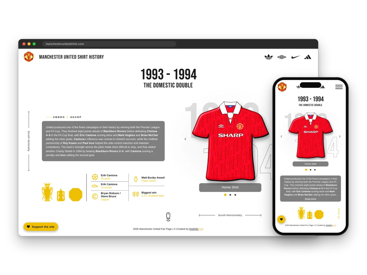
The technical challenge was turning 23 seasons into one continuous, interactive timeline. The year list down the side is the timeline itself: it marks where you are and lets you jump straight to any season. Moving from one season to the next is a page peel. The page you’re on peels away from its bottom-right corner to reveal the next season, already loaded underneath, so nothing reloads or flashes.
You can travel through the years however feels natural: scroll with a mouse or trackpad, swipe on a phone, use the arrow keys, tap the arrows or pick a year from the list. The big years behind the shirt count up as each page turns, and the arrows beside the shirt switch between the home, away and third kits.
- Page-peel transition between seasons
- Scroll, swipe, keyboard and click navigation
- Year list that doubles as a live timeline
- Years that roll over as the page turns
- Calmer motion for visitors who prefer reduced motion
-
03Phone & Desktop
Built for the Thumb and the Mouse
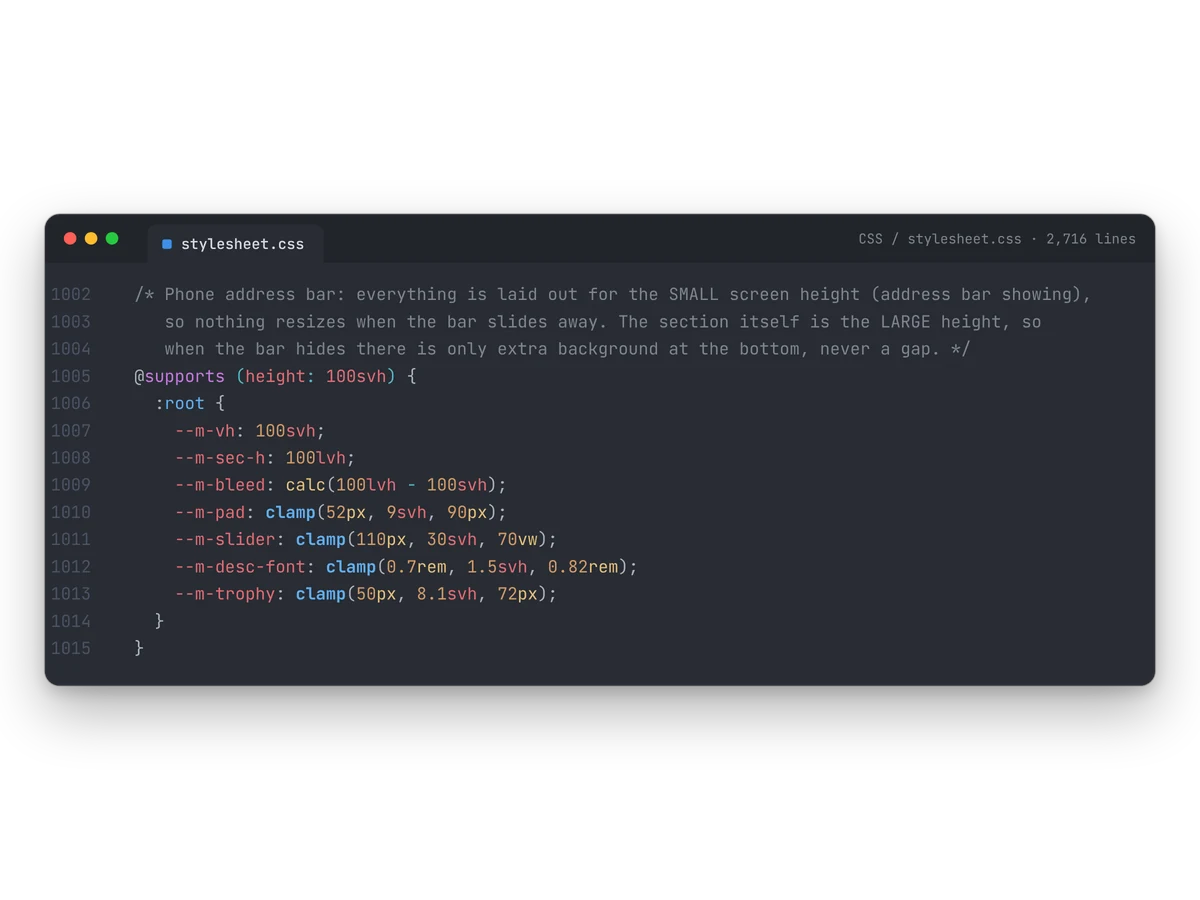
On a phone the layout is rebuilt for one hand. Swiping up turns the page, the arrows and dots switch shirts, the timeline folds into a menu, and the story shortens to a few lines with a Read more panel. The top scorer and assists move into that panel too, so the shirt stays the star of the screen. On desktop everything sits side by side, and the trophies tuck away when a longer story reaches them.
Each season also has its own colour scheme, so turning from the blue of 1996–97 to the white of 1997–98 and the red of 1998–99 feels like moving through time. The layout switches at one exact width and sizes itself to the visible screen, so mobile browser bars never cut anything off.
- Swipe-first navigation on phones
- Menu with the full timeline
- Read more panel for longer stories
- A colour scheme for every season
- Sized to the visible screen on mobile
-
04Pure Code
Hand-Coded From Scratch
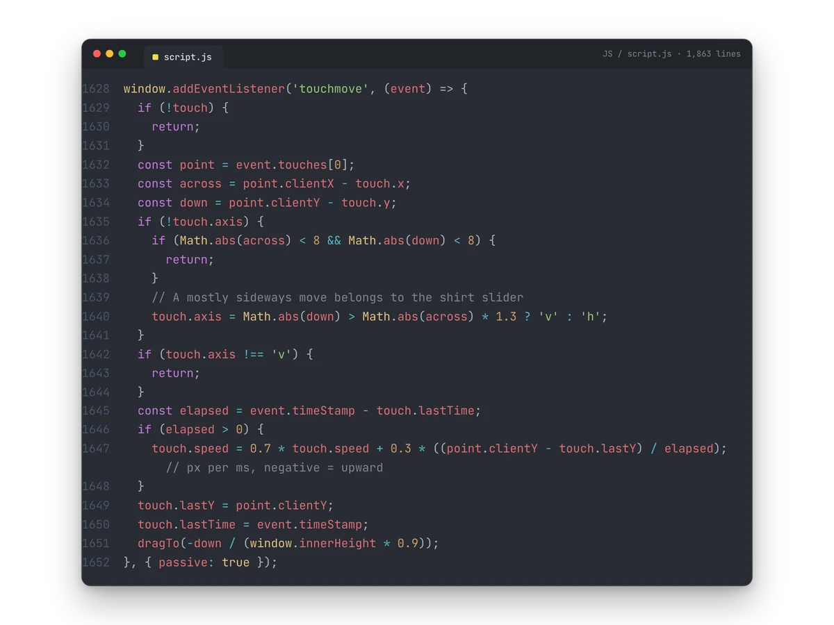
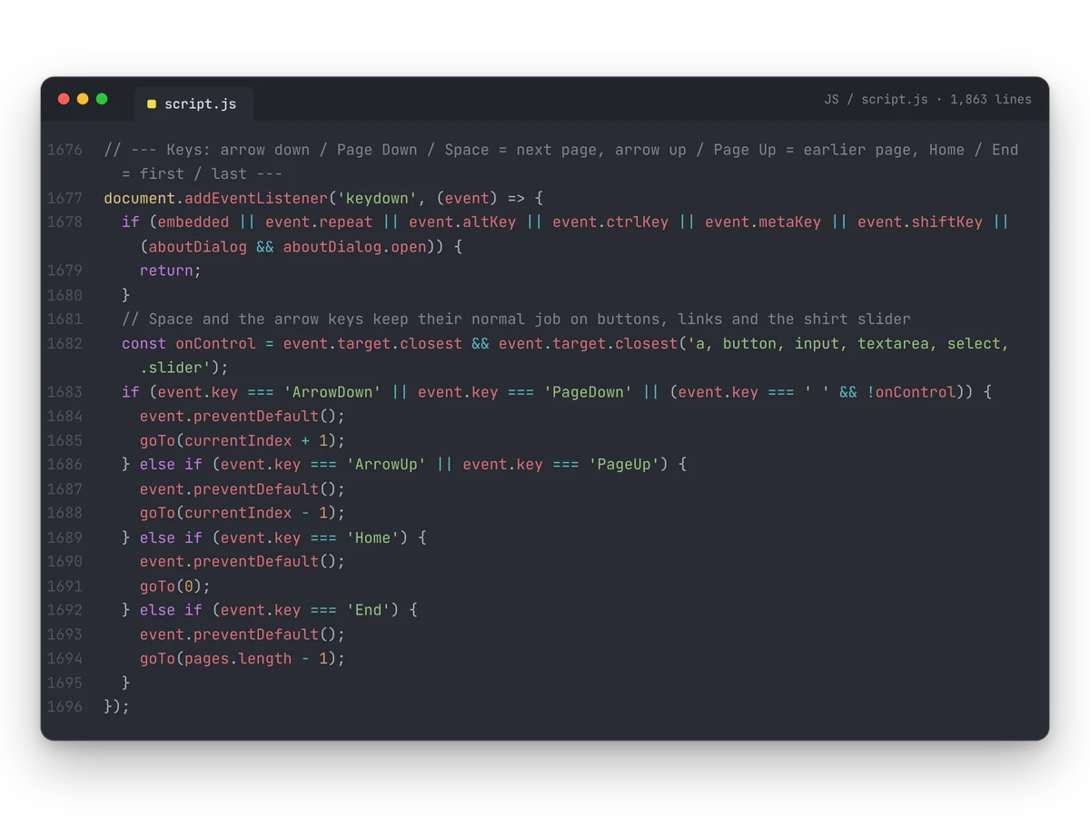
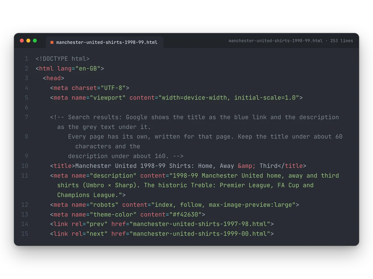
There’s no framework, library or website builder behind the site: just HTML, CSS and a single JavaScript file that every page shares. Each season is its own page with its own address, title and description, which keeps every season easy for Google to find, while the script makes the jump from one page to the next feel like one continuous experience.
Keeping it lightweight meant measuring the page in as few places as possible, so resizing stays smooth, and preparing the next season in the background, so each page turn is instant. A gold Support the site button opens a small panel with a Ko-fi donation link and a way to get in touch about collaborations.
- HTML, CSS and vanilla JavaScript
- One shared script for all 23 pages
- A page per season for search engines
- Sitemap, page descriptions and a share image
- Ko-fi support panel
Like what you see?
Tell me about your project and I’ll help you build a brand that works this hard.

Got a project in mind? Tell me a little about it and I’ll send you an estimate.