The Seven Oaks is a traditional British freehouse pub and sports bar in Manchester’s Chinatown, established in 1824. It serves the public and the city’s hospitality industry, with seven screens, 16 taps and great value every day. I’ve been the pub’s marketing manager since 2018, looking after everything people see: the menus, posters and chalkboards, the screens, social media, events and the website, all planned week by week.
What I designed, why, and how each piece fits the brand.
01Since 1824
A Freehouse Since 1824
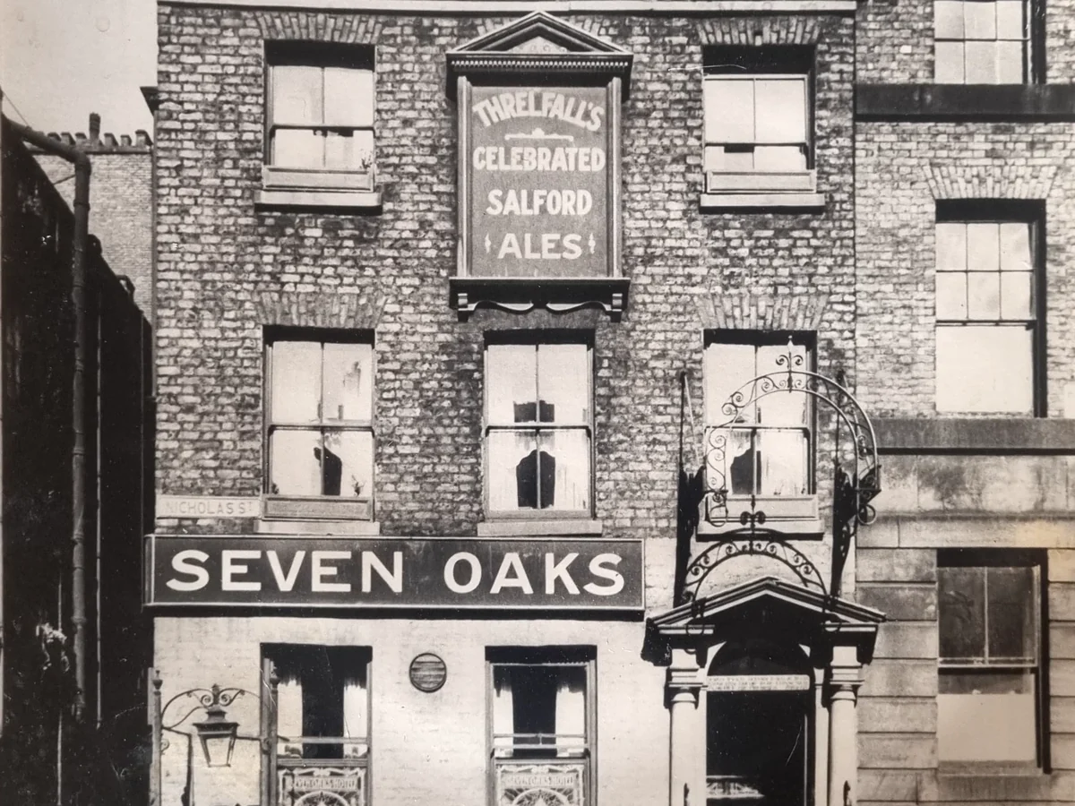
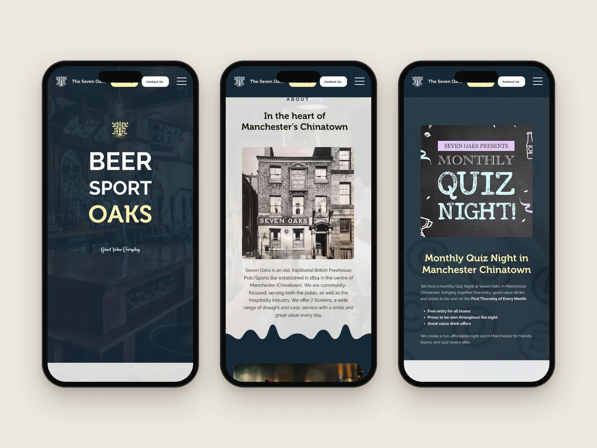
The pub’s history is part of its brand. An old photo of the building, with Threlfall’s Celebrated Salford Ales above the windows and SEVEN OAKS over the door, leads the About section of the website. The year it opened appears on the house beer badges too: 18 on one side of the oak and 24 on the other.
Established in 1824
Independent freehouse
Heritage photo on the website
1824 on the house beer badges
02Brand
One Oak, Everywhere
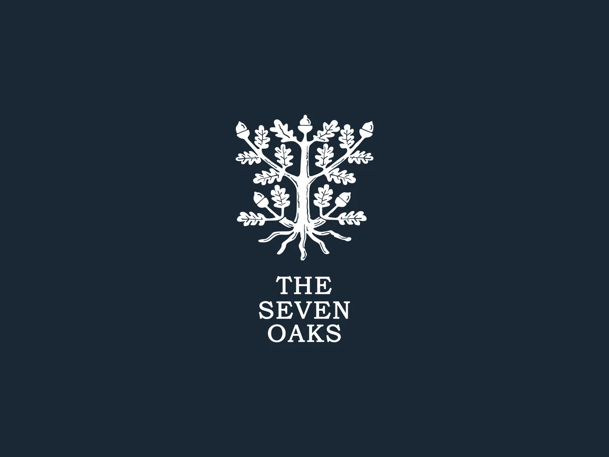
Everything I make for the pub starts from the same few pieces: the oak tree, with its acorns and roots, the stacked THE SEVEN OAKS wordmark, and a one-line version for narrow spaces. I gathered them on a brand board, so every menu, poster, screen and post uses them the same way, whether it’s white on navy behind the bar or oxblood on cream.
Oak tree mark with acorns and roots
Stacked and one-line wordmarks
A brand board to keep it consistent
White, navy, oxblood and cream versions
03Colour Palette
Colour Palette
The palette is deep navy, oxblood and a soft cream. Navy leads, from the website header to the menu covers and screen adverts. Cream picks out headlines and buttons, like the OAKS in Beer, Sport, Oaks, and oxblood brings the warmth of a traditional pub. They’re rich, dark colours that stand out on the screens and read well in a dim bar.
RalewayBody copy and the homepage headlineBeer, Sport, Oaks
04Typography
Typography
Museo carries the headings: a friendly slab serif that feels solid enough for a sports bar but still warm. Raleway handles the body copy and the big BEER SPORT OAKS headline on the website, and a script sets the Great Value Everyday line that signs off the menus and the homepage.
Museo for headings
Raleway for body copy
A script for Great Value Everyday
The same pairing in print and online
05Menu Design
Sport, Beer, Oaks
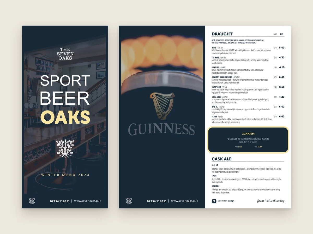
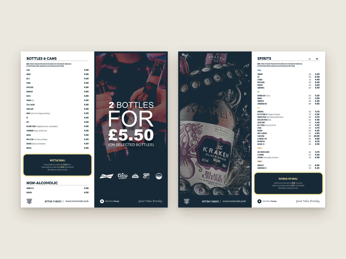
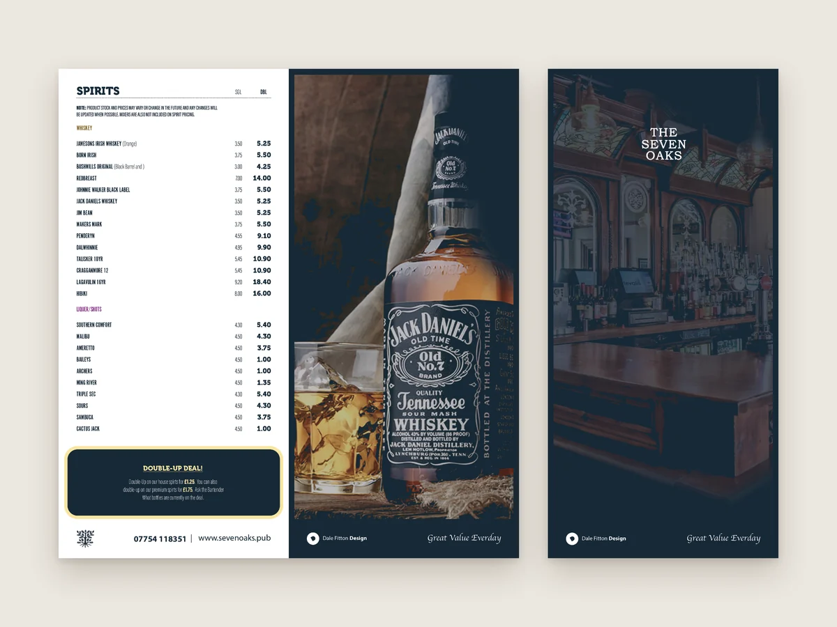
The DL drinks menu opens on the pub’s line, Sport Beer Oaks, over a photo of the bar. Inside, every list sits beside a full-height photo or offer: Guinness next to the draught beers, the 2 bottles for £5.50 deal next to the bottles and cans, and Kraken and Jack Daniel’s next to the spirits.
Prices line up in clear columns, deals are boxed so they stand out, and the cask ale section tells the story behind each beer, including Oaks Ale, brewed for the pub by Facers Brewery.
DL menu, Winter Menu 2024
A photo or offer beside every list
Deals boxed so they stand out
Notes on the cask ales
06House Beers
Oaks Ale & Oaks Lager
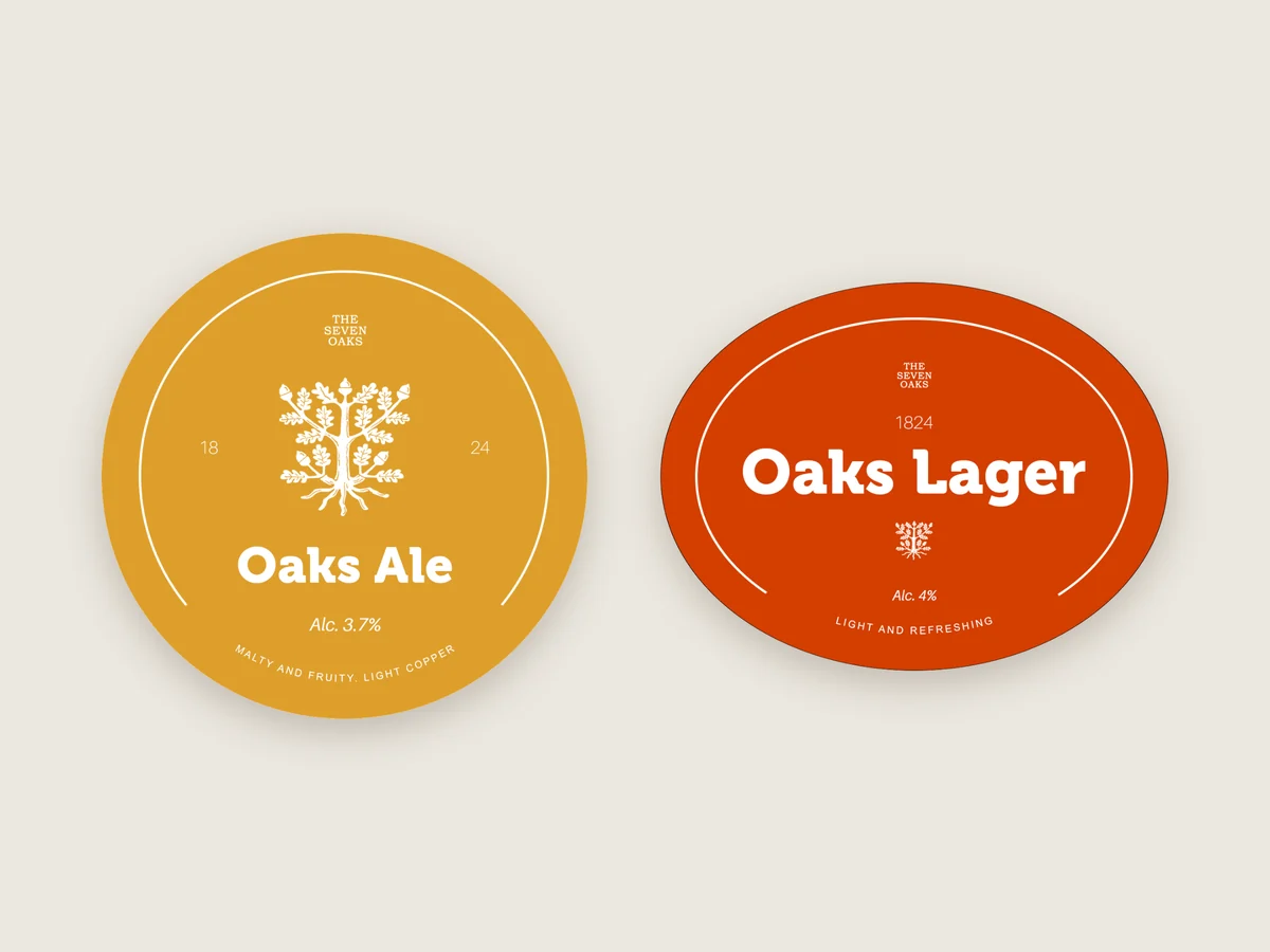
The pub pours its own house beers, Oaks Ale and Oaks Lager. I designed the tap badges to stand out on a busy bar: a round yellow badge for the ale and an oval orange one for the lager, each with the oak, the strength, a short tasting note and the year the pub opened.
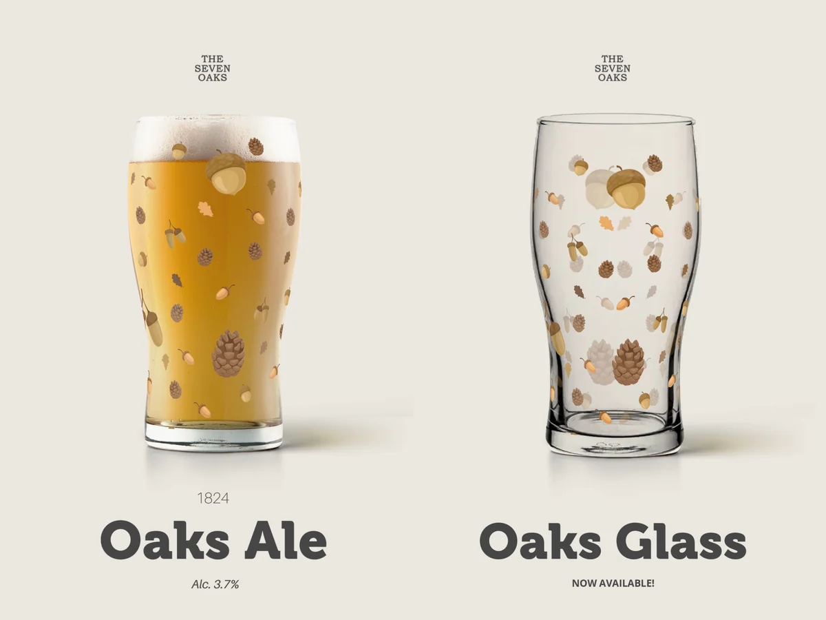
I also designed pint glasses to match, with a pattern of acorns, oak leaves and pine cones around the glass.
Round and oval tap badges
Strength and tasting notes
1824 on every badge
Branded pint glasses to match
07A-Board Posters
Chalkboards for the Street
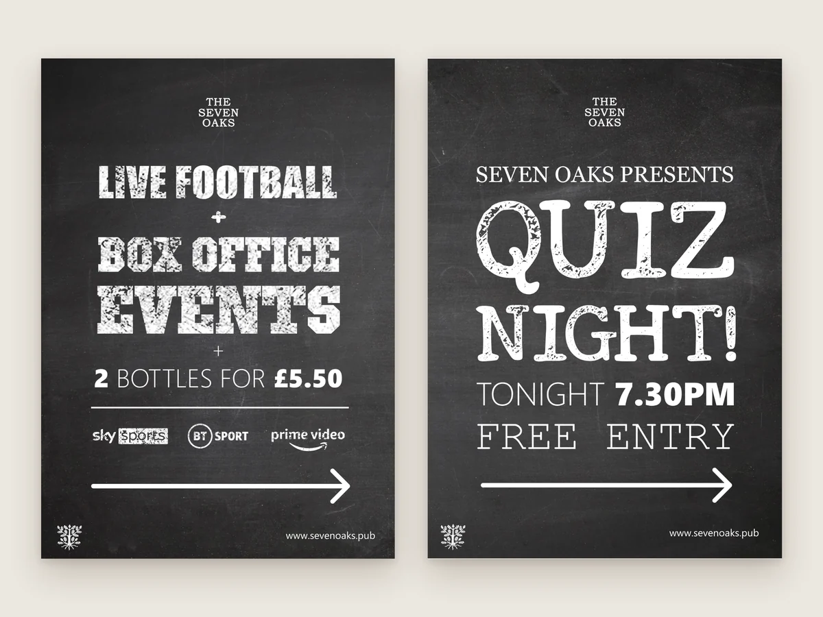
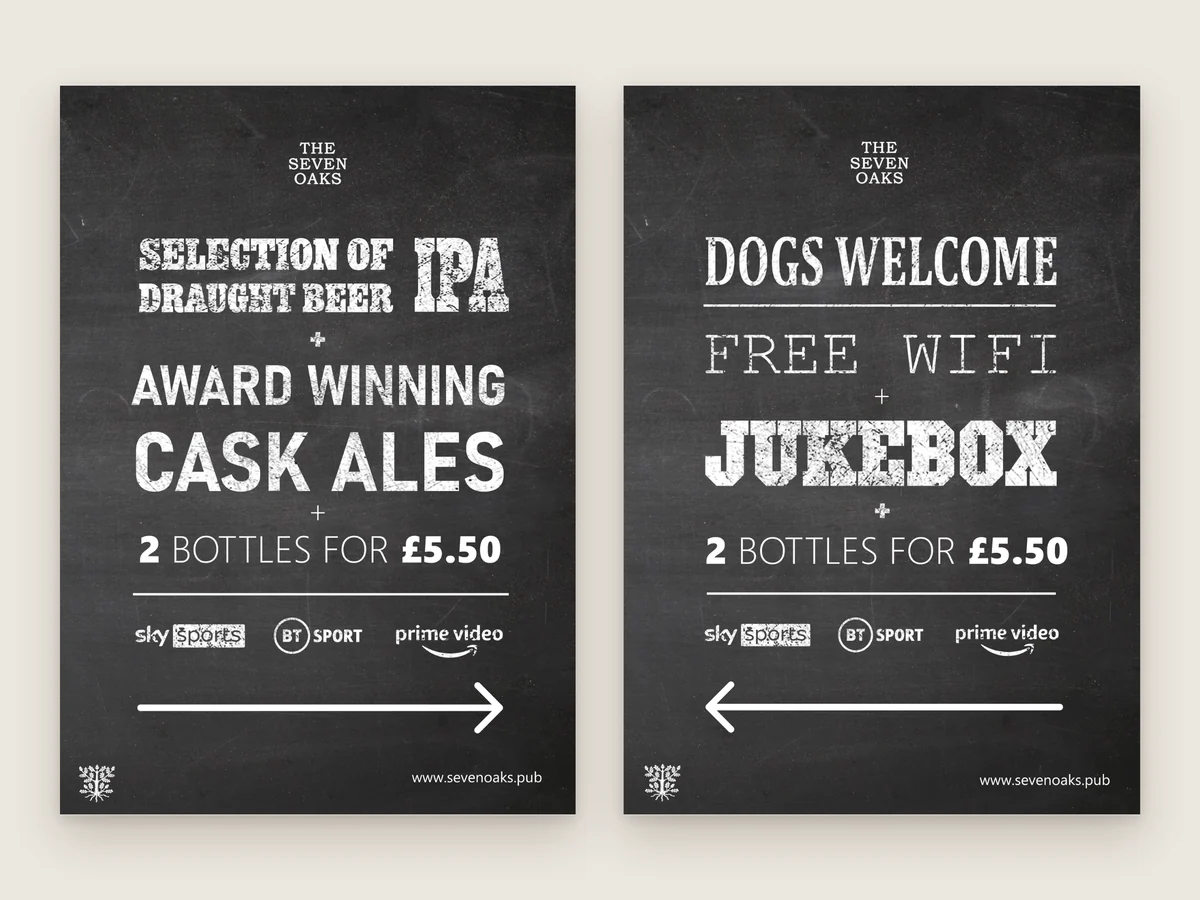
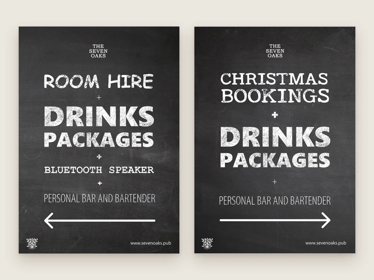
A-boards outside catch people walking through Chinatown. I designed a set of posters with a chalkboard look, so they feel like a traditional pub board but stay crisp and easy to swap: live football and box office events, quiz night, cask ales, dogs welcome, room hire and Christmas bookings.
The sport boards carry the channels the pub shows, and every board finishes with a big arrow pointing the way in.
Chalkboard-style A-board posters
Bold, hand-drawn headlines
Sport channels on the sport boards
Arrows pointing the way in
08Flyers & Posters
Midweek Happy Hour
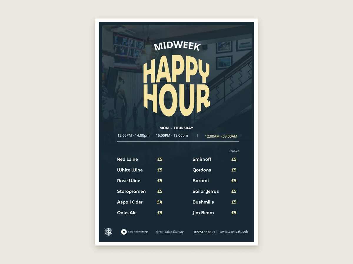
The Midweek Happy Hour flyer leads with a big, bold headline in cream on navy, with the days and times underneath and the drinks and prices laid out in two clear columns.
A matching square goes out on social media, so the offer looks the same on the bar as it does online.
A5 Happy Hour flyer
Days, times and prices at a glance
A matching square for social media
Navy and cream, on brand
09Screen Adverts
Seven Screens, Always Something On
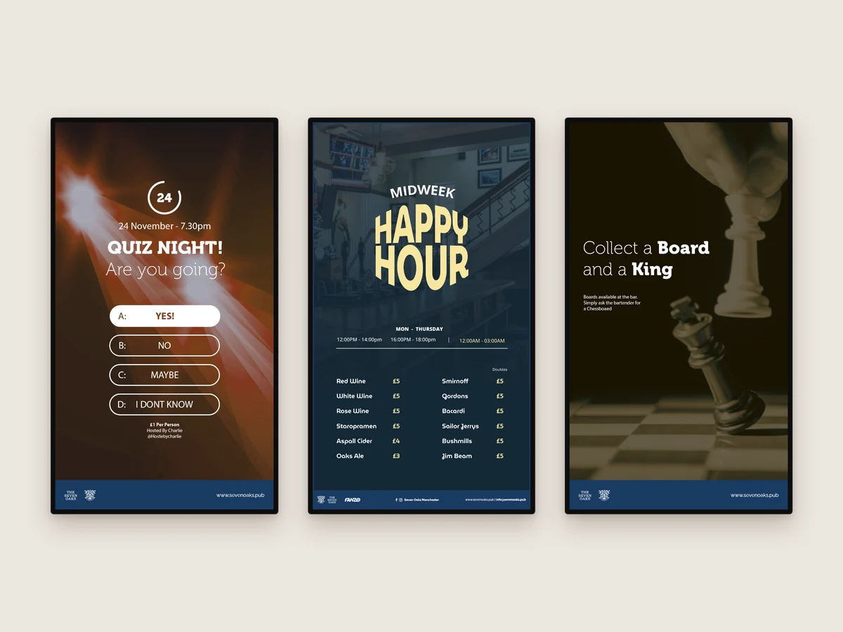
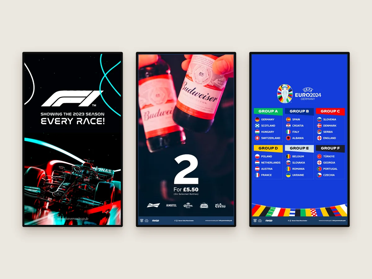
Alongside the live sport, the pub’s screens carry adverts I design in portrait, at 1080 × 1920: quiz night, Happy Hour, the chess board and drinks offers, plus the big sport coming up, from Formula 1 to the Euros.
They’re built from templates in the pub’s colours, so new adverts are quick to make when the fixtures change.
Portrait 1080 × 1920 adverts
Prices, deals and events
Upcoming sport
Templates for quick updates
10Social Media
Posts That Fill the Week
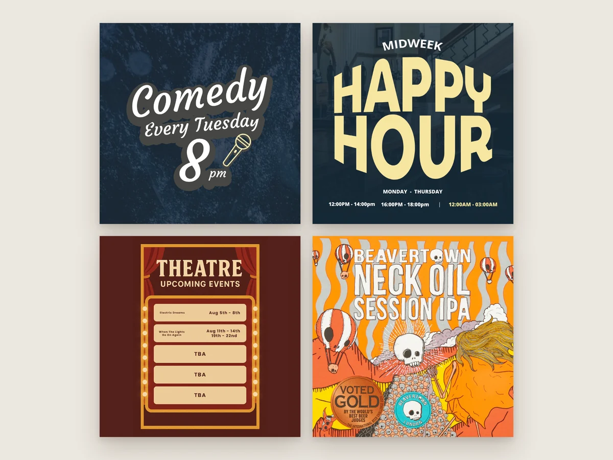
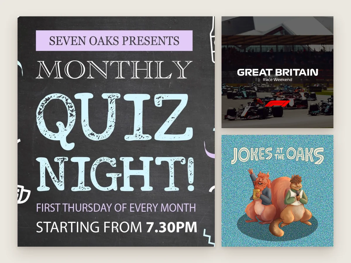
On Instagram and Facebook, the posts follow the same look as the screens and print: comedy every Tuesday, midweek Happy Hour, the monthly quiz, theatre listings, guest beers like Beavertown Neck Oil, and race weekends for Formula 1. One style across every channel means people recognise a Seven Oaks post before they’ve read it.
Instagram and Facebook posts
Events, deals and guest beers
Sport weekends
The same look as the screens and print
11Events
Jokes at the Oaks
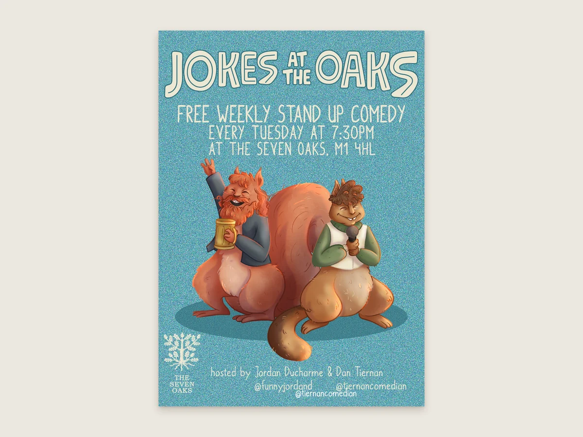
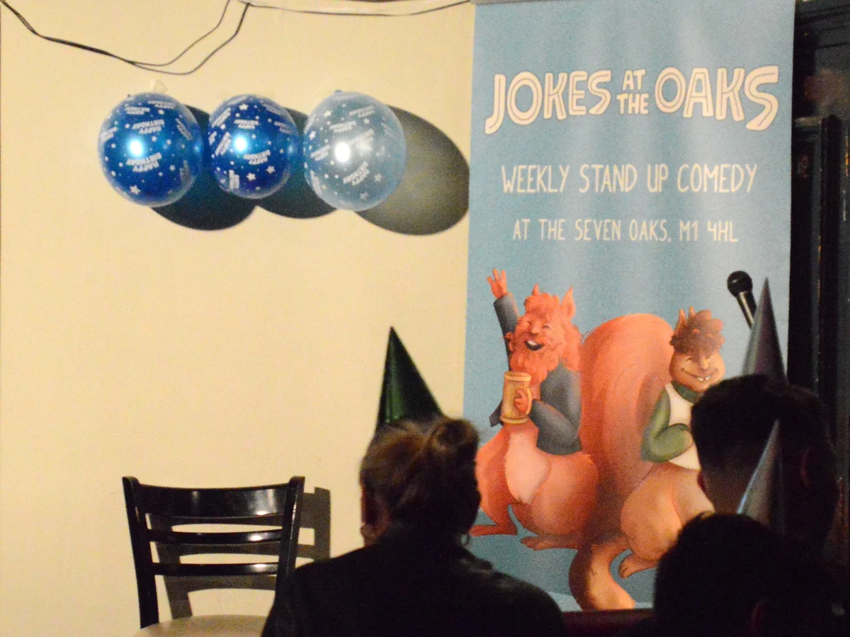
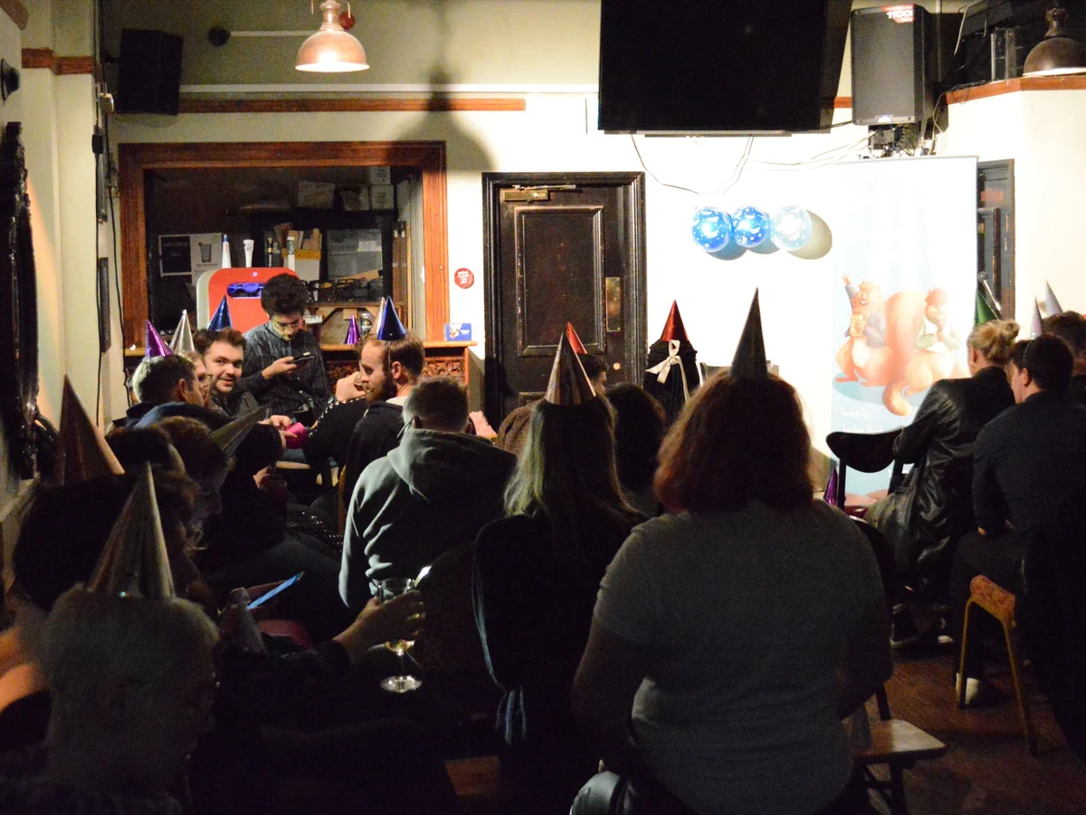
Jokes at the Oaks is a free weekly stand-up comedy night at the pub. Using the show’s own logo and squirrel illustrations, I designed the poster, the screen advert and a DL menu panel, so the night looks the same on the wall, on the screens and online.
Free weekly stand-up comedy
Poster, screen advert and menu panel
Built around the show’s own artwork
Promoted on the screens and social media
12Web Design & Development
The Website
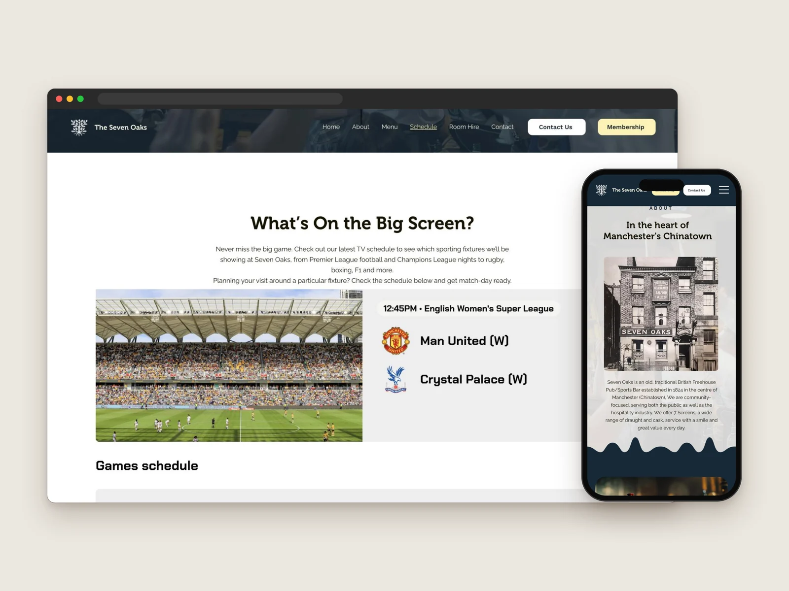
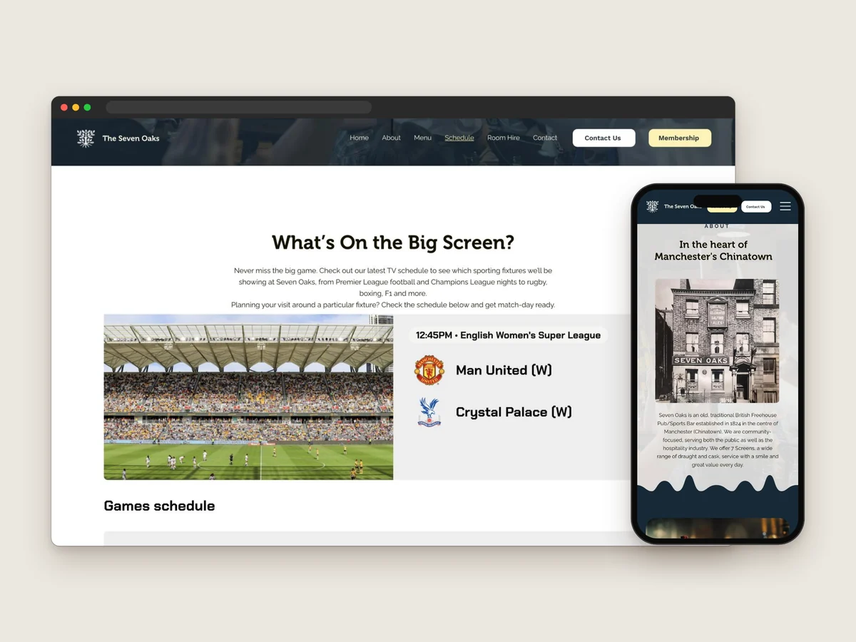
I designed and built the pub’s website on Wix. It opens on Beer, Sport, Oaks over a photo of the bar, then covers everything the pub offers: its history, the sports bar, deals, the monthly quiz, the industry membership and room hire.
The TV schedule shows what’s on the big screen next, so fans can plan their visit around a fixture, and each section is written around what people search for, like quiz nights and room hire in Manchester city centre.
Designed and built on Wix
TV schedule of upcoming games
Written for local search
Works on phone and desktop
13Scheduling
Planning the Week
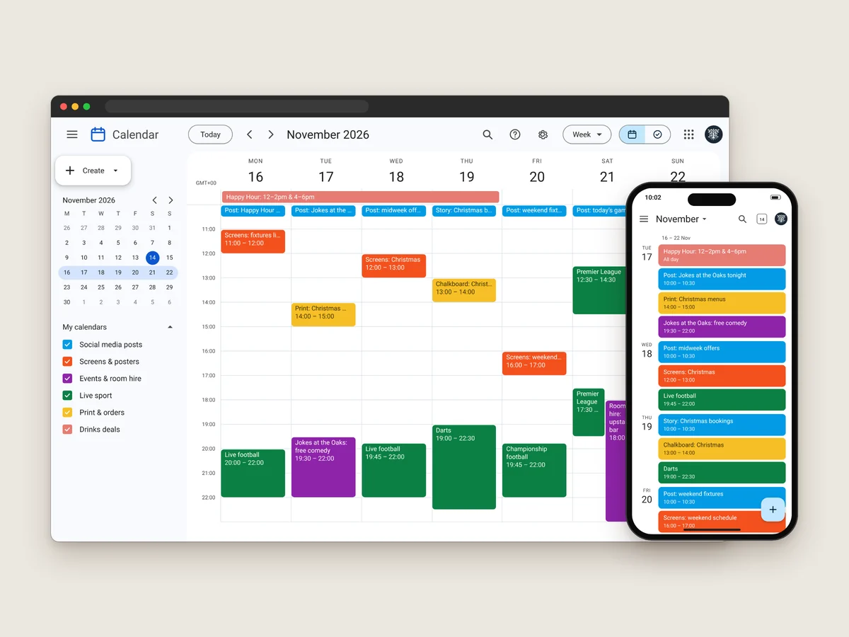
With posts, screens, print, events and live sport all happening at once, scheduling keeps everything on time. I plan each week in Google Calendar, with a colour for each kind of job: social media posts, screen adverts and posters, events and room hire, live sport, print and orders, and drinks deals.
Posts go out ahead of the nights they promote, the screens are updated before the weekend’s games, and print is ordered early for busy times like Christmas.
Google Calendar for the weekly plan
A colour for each kind of job
Posts timed around events and fixtures
Print ordered ahead of busy periods
14Staff Uniform
A Shirt for the Team
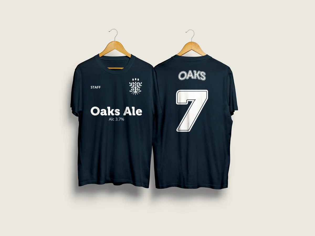
Fitting for a sports bar, I designed the staff uniform as a football shirt: navy, with the oak as the club badge, STAFF on the chest, Oaks Ale as the shirt sponsor and OAKS 7 on the back.





Got a project in mind? Tell me a little about it and I’ll send you an estimate.