



Traders Tiki Bar
- Client
- Traders Tiki Bar, Altrincham
- Format
- Square, 210 × 210 mm, folded in half
- Work
- Menu design
- Layout & typography
- Print-ready artwork
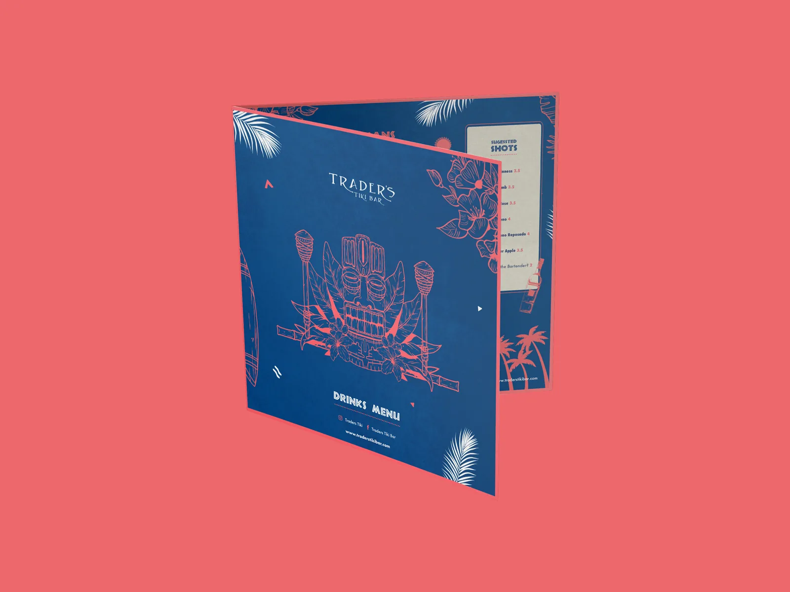
Traders Tiki Bar is a tiki bar in Altrincham, and I designed their drinks menu. The idea was to create a bright, vibrant menu to match the tiki theme: something that feels like part of the bar the moment it’s handed over, while keeping 45 drinks easy to find and order.
- Drinks across four pages
- 45
- Cocktails, each with its own glass icon
- 13
- Colours: blue, coral, cream and white
- 4
The Project
What I designed, why, and how each piece fits the brand.
-
01The Idea
Bright, Vibrant and Unmistakably Tiki
Tiki is all about escapism: carved masks, flaming torches, tropical flowers and palm trees. Rather than a plain list of drinks, the idea was a bright, vibrant menu that captured that theme. I built the palette around a deep blue background, so the coral illustrations and headings really pop, with cream panels to spotlight the signature cocktails and suggested shots, and white for everything that needs reading at a glance.
- Four-colour palette taken from the tiki theme
- Coral line illustrations on deep blue
- Playful tiki-style headings
- High-contrast lists that read well in a dim bar
-
02Front Cover
A Cover That Sets the Scene
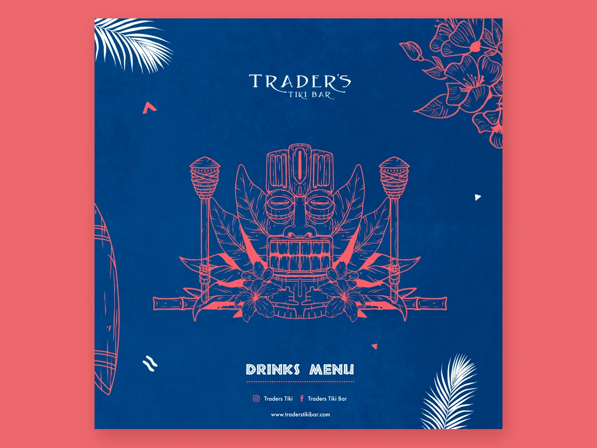
The front cover is the first thing people see when they sit down, so it leads with the Trader’s Tiki Bar logo above a tiki mask framed by torches, hibiscus flowers and palm leaves. Drinks Menu sits underneath, followed by the bar’s Instagram, Facebook and website, so guests can find the bar online too.
- Logo and tiki mask centrepiece
- Torch, hibiscus and palm leaf illustrations
- Instagram, Facebook and website on the cover
-
03Inside
Easy to Order From
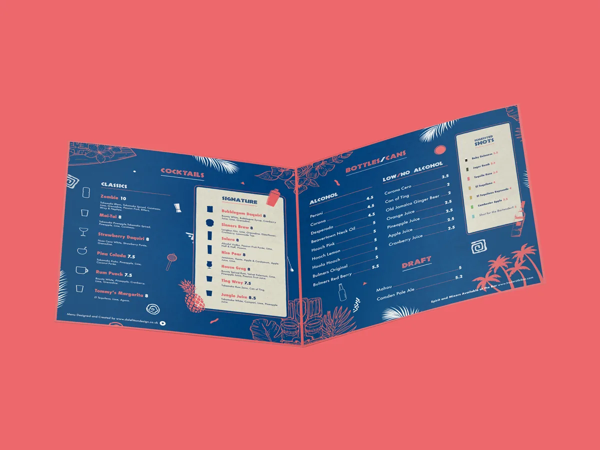
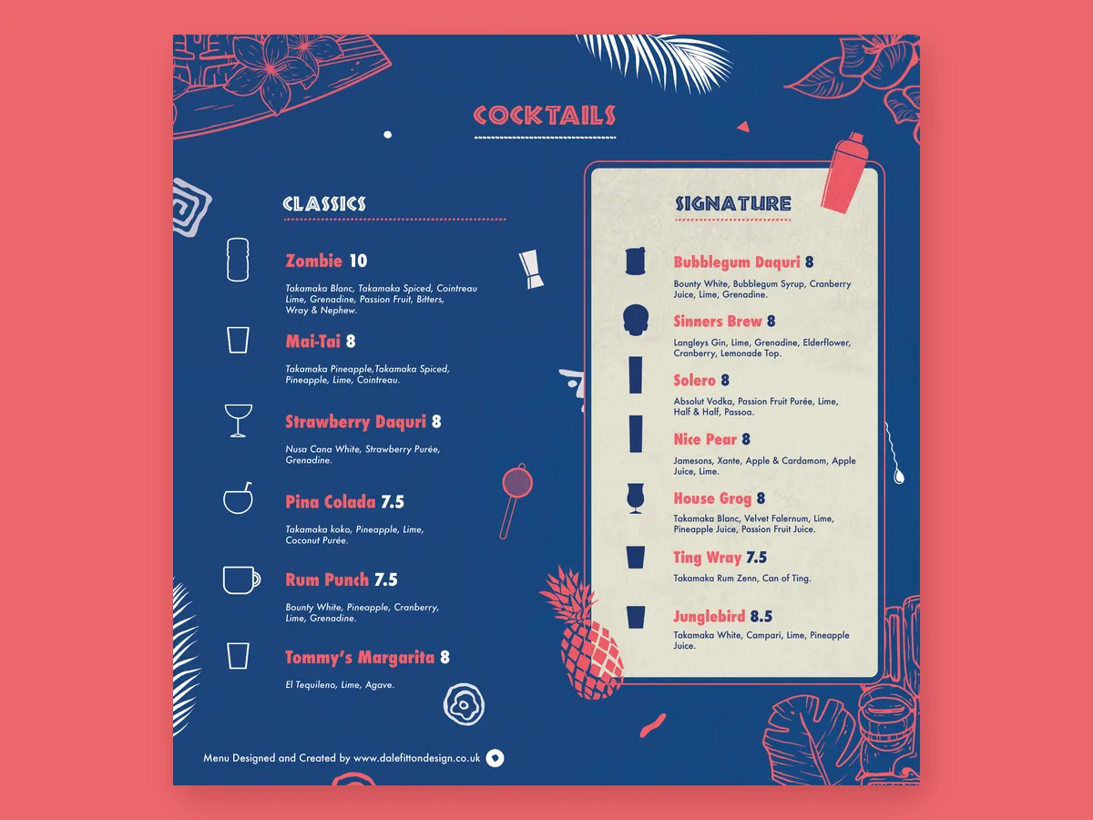
Opening the menu shows the cocktails on the left and everything else on the right. The six classics each have a simple outline of the glass they’re served in, while the seven signature cocktails sit on a cream panel with solid glass silhouettes, so the bar’s own drinks are the first thing your eye lands on.
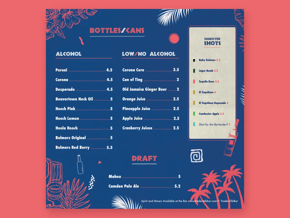
On the right, bottles and cans are split into alcohol and low or no alcohol, with dotted leaders running across to each price and the draft beers underneath. A second cream panel suggests shots, each marked with its own colour. Pineapples, a cocktail shaker, a strainer and palm trees fill the gaps without crowding the lists.
- Classic and signature cocktails side by side
- A glass icon for every cocktail
- Dotted price leaders for quick scanning
- Cream panels for signatures and shots
- Low and no alcohol given equal space
-
04Back Page
A Wine List That Fits the Theme
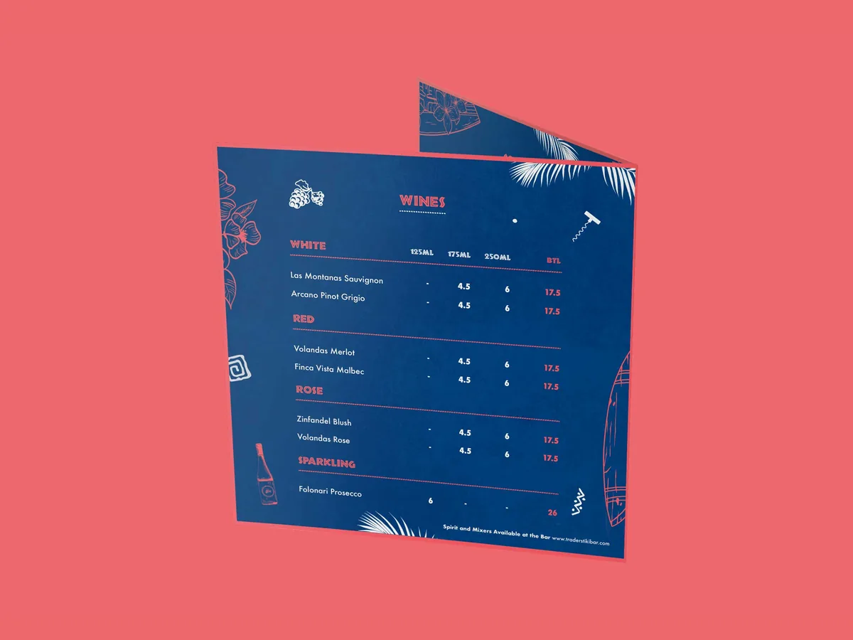
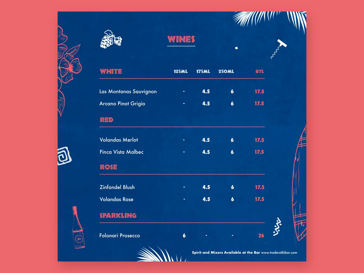
The back page carries the wine list: white, red, rosé and sparkling, with prices for 125 ml, 175 ml and 250 ml glasses and the bottle laid out in columns, so they’re quick to compare. Grapes, a corkscrew and a wine bottle give the page its own character, while the palm leaves, hibiscus and a surfboard wrapping round from the front keep it part of the same tiki world.
- Wines grouped by type
- Glass and bottle prices in clear columns
- Wine illustrations in the same line style
- The bar’s website in the footer
Like what you see?
Tell me about your project and I’ll help you build a brand that works this hard.

Got a project in mind? Tell me a little about it and I’ll send you an estimate.