Sitelink Group was a company created to connect the construction industry: one place where you could request plumbers, joiners, electricians, painters and decorators and the rest of the trades a job needs. I designed the brand identity, from the logo, typography and colours to the business cards, and the brand carried through to the company’s live website.
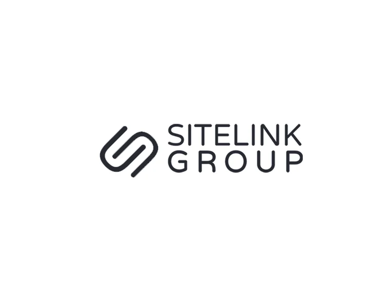
Links in the logo, forming an S
2
Logo versions
3
Brand colours
3
The Project
What I designed, why, and how each piece fits the brand.
01The Idea
Linking the Trades Together
Every construction job relies on lots of different trades turning up at the right time. Sitelink’s aim was to link them together, so the brand needed to say connection at a glance. The icon does it with two rounded links hooked into each other, and the way they overlap also forms an S for Sitelink. On dark backgrounds one link is yellow and the other white, so you can see both halves of the connection.
One place to request any trade
Two links that form an S
Connection at the heart of the brand
Made for the construction industry
02Logo Design
Logo Design
The wordmark sets SITELINKGROUP in capitals as one word, with the link icon in front. I made a horizontal version for headers and signs, a stacked version with GROUP spaced out to the width of SITELINK, and the icon on its own. Each version works on yellow, charcoal or white, so the logo always has a background that suits it.
Link icon that doubles as an S
Horizontal and stacked versions
Two-tone icon for dark backgrounds
Works on yellow, charcoal or white
Varela RoundLogo and headingsAaABCDEFGHIJKLMNOPQRSTUVWXYZ abcdefghijklmnopqrstuvwxyz 0123456789Regular
Open Sans LightBody copyConstructing teams and building relationships
03Typography
Typography
Varela Round’s soft, rounded letters pick up the curves of the link icon and keep a construction brand friendly rather than hard-edged. It’s used for the logo and headings, with Open Sans Light for the smaller copy, so longer text stays light and easy to read.
Varela Round for the logo and headings
Open Sans Light for body copy
Rounded letters that match the icon
Clear at small sizes
04Colour Palette
Colour Palette
Yellow is the colour of the building site, from hard hats and hi-vis to safety signs, so it felt right for a company built around the trades. A deep charcoal grounds it and carries white or yellow type, and white keeps everything clean, so the brand is bold without shouting.
Construction-site yellow
Deep charcoal to ground it
White for clean space
Strong contrast on every pairing
05Website
The Brand in Use
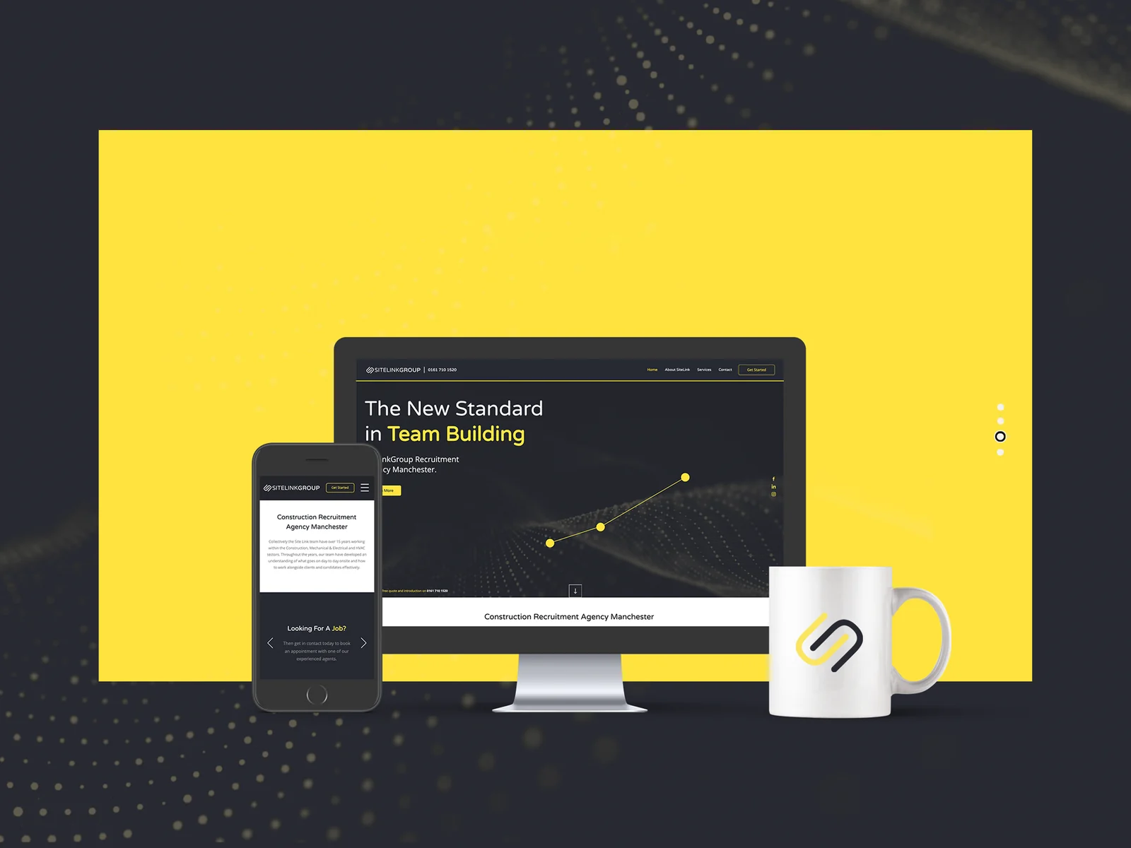
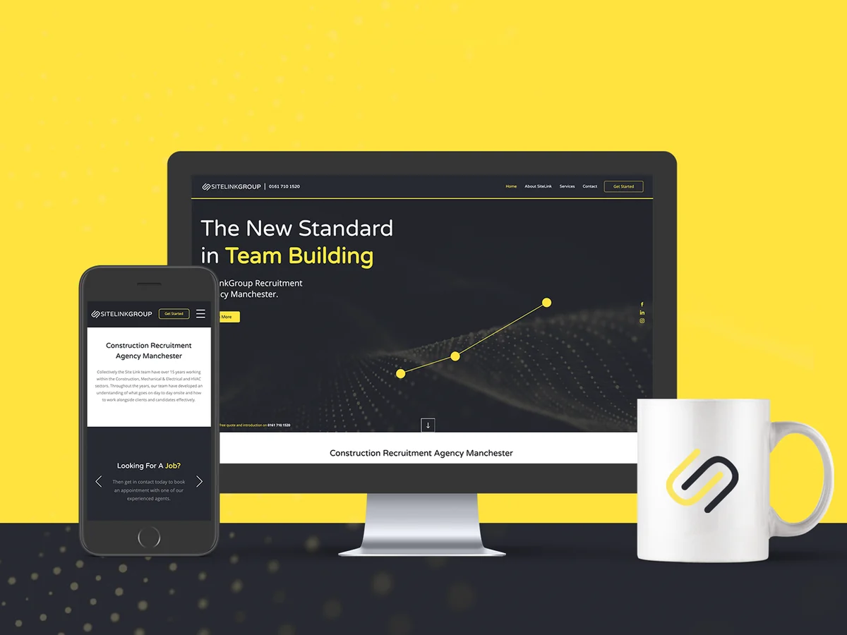
The brand carried through to Sitelink’s live website. The charcoal and yellow led with the headline The New Standard in Team Building, the link icon sat in the header, and the same look worked on a phone, with Varela Round headings and Open Sans for the body copy. The two-tone icon also went on a branded mug.
Live website on desktop and phone
Charcoal and yellow site styling
Varela Round headings, Open Sans copy
Branded mug
06Business Cards
Business Cards
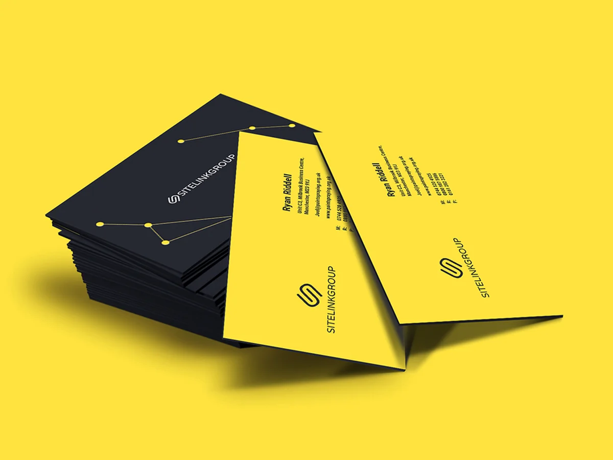
The business cards are double-sided. The charcoal side carries the wordmark and a pattern of yellow dots joined by fine lines, like a network linking people together, and the yellow side has the contact details running up the card beside the icon.





Got a project in mind? Tell me a little about it and I’ll send you an estimate.